Had that interview today. Auxiliary Services' graphic design department here look for new fresh designers, because people keep on graduating and so they want people who'll be able to stay around for a while, which is why they harvest from starting-level classes. We'll see how I did... (hey, though, one thing I know I did well with, I had that big test yesterday, and I'm pretty darn sure I got a 100% on it.)
The interview, it was basically a portfolio review-- I learned a lot on how those look, which is good, because there's that BFA thing eventually and it's never too early to start prepping for that. Some protips I learned from the review:
- I didn't have that many designs that utilized typography- I tried to put a few in, but I just don't have that many. Typography is muy importante- graphic design is called "graphic design," but 99%, fundamentally, it means typography.
- When showing your portfolio, "why is king," so explain why you did what you did, especially the process of everything-- knowing the process, the story behind the piece, opens your eyes to it in a new way (Which I have heard before.)
- My design style is highly reminiscent of printmaking. I should take a printmaking course. Because it'd be awesome and apparently I'd be good at it. (Printmaking class has two prerequisites, and I am taking both next semester, so I'll be able to take it within two semesters, so hey.)
- Post up on Behance a bunch (Behance is this website Adobe does where you can share your Photoshop/Illustrator/whatever project.) Knowing you're going to make your designs public give you that extra push to make them extra good and not embarrassing.
- By the advanced period of achieving a graphic design degree, basically everyone in the program with you has a job on campus designing at one place or another.
- Use each piece in your portfolio to show: hey, I know how to establish visual hierarchy, and all that.
- Value is also something to keep an eye on. Like, the screenshot of your web design in your portfolio, you could stand to push the value up in here, dark against dark in these sidebars over here is a little hard to read.
Well, thank you. Fixed!
- It's good to start in web design so early, though, because if you're used only to designing on a page and then you get into web design, there's just so much space you don't know what to do with.
That's good stuff. Even if I don't get a, callback or whatever, that was really instructive information, so the experience was 100% worth it.
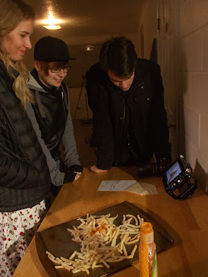
So anyway, meanwhile. Today, our apartment got taken over by a student film crew (though, I don't think any of them are actually film students) shooting a short film.
 |
| Reviewing the footage at the end of the shoot. Also fries. |
So, yeah, there was sooo much smoke(-type stuff.) Which still hasn't entirely dissipated.

No comments:
Post a Comment